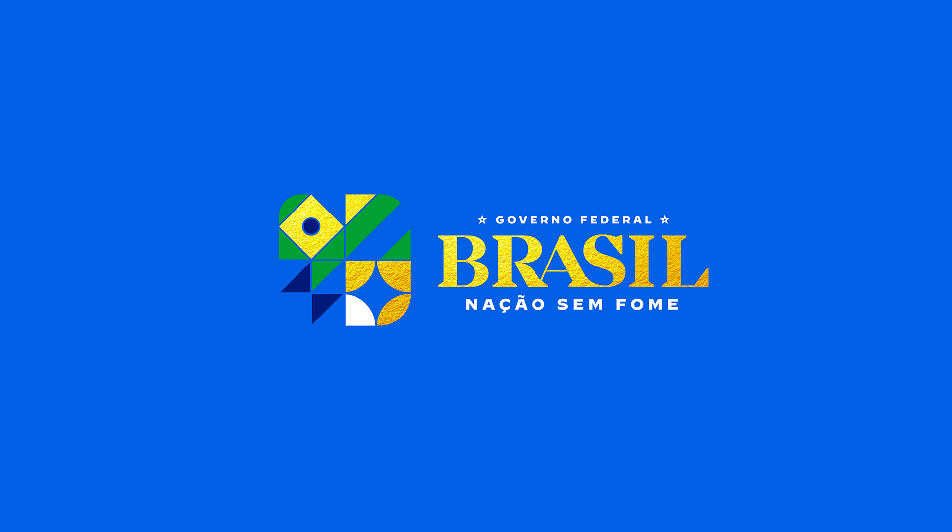
BRAZIL – FEDERAL GOVERNMENT
Brand prototype for Federal Government of Brazil (DF) – 2022.


We must shift our focus from merely being a country to envisioning the creation of a nation—a nation that embodies true freedom and democracy. It should be a nation marked by fraternity, diversity, and a commitment to values such as dialogue, respect, inclusion, and equity. In this envisioned nation, we decree that no more of our brothers and sisters shall suffer from hunger.
Building our Brazilian nation requires collective effort from all of us. We must address social inequality, safeguard the environment, and unwaveringly uphold democracy. It's time to move beyond the divisive mindset of us vs. them and embrace a unified us to propel us forward.
To symbolize our diverse nation, we propose a symbol with multiple meanings, incorporating elements such as a flag, a bird, and a star. These symbols are complemented by architectural traces inspired by Brasília, our federal capital, which houses the three branches of government.
The choice of uppercase serif typography in the design of the Brazil logotype is intentional. It aims to convey the idea of a government that is serious and robust, committed to action across various fronts in the pursuit of building a nation where people can not only reside but also live with dignity.
Furthermore, in reclaiming the colors of our national flag and distancing ourselves from the yellowish tone associated with the national team's jersey—tarnished by the extreme right—it is only fitting that we adopt a golden hue moving forward. Are we prepared to embrace this change?


Brand Designer
Milton Raposo
@raposo.work
@mill.man